PROJECT BRIEF
The goal of this project was to create a new visual identity system for a museum in the city where I live. I chose to rebrand the Sheldon Museum of Art, an art museum largely focusing on American art. To create an additional challenge, I chose to create this entire project in the timespan of 24 consecutive hours. This made sure my decisions were efficient and well-planned, to avoid any time wastage.
CHALLENGE
For this project I wanted to implement a simple and modern design, but one that would be relevant to the museum's history and exhibitions. Choosing to follow a minimalist swiss-inspired design, this style is modern but also referential to the 50s, 60s, and earlier eras when the Swiss Style was particularly popular. Built in the early 60s, I felt this was appropriate for the museum's visual identity.
ROLE
Research, Branding and Visual Identity, UI Design, Web and Print Graphics, Promotional Materials
TOOLS
Illustrator, Photoshop
TEAM
Solo Designer
WHY
Independent Project


COLOR AND FONT
When approaching this project I knew I wanted a minimal design, so I chose to utilize two neutrals, one dark and one light, for the primary text and background colors. The off-white color is also used to reference the travertine that the museum is constructed from. More vibrant colors were reserved as visual decorations for posters and images of the museum's artwork, to create more visual interest in those instances.
The colors are from the CMYK color space.
I chose Helvetica Neue as my primary typeface because of its classic history alongside the Swiss Style, and made it bold and condensed to reflect the minimalist design ideas behind this project. For the secondary typeface I chose ITC Avant Garde Gothic Pro, which complimented Helvetica Neue with its thinner forms.

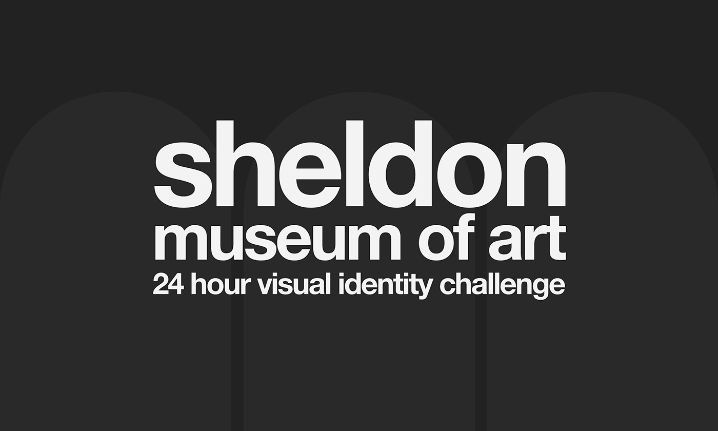
LOGO
For the logo I experimented with designs featuring the museum's iconic exterior arches. Working with both angled and head-on views, I created several variations of the main logo. Eventually I settled on a simple design featuring three arches viewed head-on, with the museum's name boldly written underneath. It was simple yet visually intriguing. I chose to represent three arches to reflect the grid systems used in these designs, with groupings of three often being used to break up the designs vertically.
I also created pattern swatches in the shape of the several gold-plated lighting units in the ceiling of the museum's great hall. Any guest of the museum has surely seen these iconic additions, and would recognize this design as another callback to the building's architecture.


ADDITIONAL MEDIA
I also designed Swiss Style posters of some of the museum's more well known sculptures, choosing vibrant colors to make the shapes of the sculptures pop out from the poster.
In addition to these posters I designed an advertisement and covers for exhibition catalogs, all featuring prominent works of art from the museum's collection. I also created merchandise featuring the museum's logo.


